Now follow the graph and questions.
Graph1
Questions:
Pls follow the graph which show the passengers of London city. Write the summery of the graph.
1. You have to write at least 150 words
2. Will get 20minutes of time.
model answer:
The graph shows the fluctuation in the number of people at a London underground station over the course of a day.
The busiest time of the day is in the morning. There is a sharp increase between 06:00 and 08:00, with 400 people using the station at 8 o'clock. After this the numbers drop quickly to less than 200 at 10 o'clock. Between 11 am and 3 pm the number rises, with a plateau of just under 300 people using the station.
In the afternoon, numbers decline, with less than 100 using the station at 4 pm. There is then a rapid rise to a peak of 380 at 6pm. After 7 pm, numbers fall significantly, with only a slight increase again at 8pm, tailing off after 9 pm.
Overall, the graph shows that the station is most crowded in the early morning and early evening periods.
Graph2
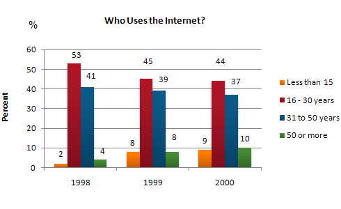
The graph shows Internet Usage in Taiwan by Age Group, 1998-2000.
Summarise the information by selecting and reporting the main features, and make comparisons where relevant.
The graph shows Internet Usage in Taiwan by Age Group, 1998-2000.
Summarise the information by selecting and reporting the main features, and make comparisons where relevant.
- You should write at least 150 words.
- You should spend about 20 minutes on this task.

model answer:
The graph shows changes in the age profile of Internet users in Taiwan between 1998 and 2000.
The main users of the Internet in Taiwan are young adults between 16 and 30 years old. In 1998, they accounted for more than half of all users. In 1999 the number dropped slightly to 45%, but even in 2000 they were the biggest group.
The second biggest group of users is aged between 31 and 50. They made up 41% in 1998, falling slightly to 37% in 2000. When combined with the 16-30 age group, over 94% of users in 1998 were between 16 and 50.
However this number is dropping steadily as more children and older users log on. In 1999, the number of children online quadrupled from 2% to 8%, and it continued to increase in 2000. There were similar increases for older users, rising from 4% in 1998 to 10% in 2000.
In summary, while adults between 16 and 50 still represent the great majority of Internet users in Taiwan, their share is declining as more children and older users join the web.
Graph3
You should spend about 20 minutes on this task.
The two graphs show the main sources of energy in the USA in the 1980s and the 1990s.
Write a report for a university lecturer describing the changes which occurred.
Write at least 150 words.
model answer:
The two graphs show that oil was the major energy source in the USA in both 1980 and 1990 and that coal, natural gas and hydroelectric power remained in much the same proportions. On the other hand, there was a dramatic rise in nuclear power, which doubled its percentage over the ten years.Oil supplied the largest percentage of energy, although the percentage decreased from 42% in 1980 to 33% in 1990. Coal in 1990 was the second largest source of energy, increasing its proportion to 27% from 22% in the previous decade. Natural gas, the second largest source in 1980 at 26%, decreased its share very slightly to provide 25% of America’s energy ten years later. There was no change in the percentage supplied by hydroelectric power which remained at 5% of the total energy used. Nuclear power the greatest change: in 1990 it was 10%, twice that of the 1980s
Source


Nice post about IELTS Writing Topics. it is an interesting.
ReplyDeleteYour site are very usefull to me.
ReplyDeleteielts coaching classes,ielts center,ielts classes,ielts training in mohali